The best programming font
Us programmers like to customize our programming environment to the maximum. If arguing about text editors and customizing your .bashrc weren't enough, we also modify a 20 year old Apple Extended II keyboard to change its keyswitch tone, remap our keyboard layout to redefine the CapsLock key, and of course decide on which programming language to use for our projects.
For those who really like customization, however, there are more aspects to it. One of those is, of course, the programming font choice. Leaving aside the fact that unless you're using a monospaced font you're a monster, some people like the classics, like Courier (New), others use the default ones, and some of us really like the retro visuals and opt for one of the nostalgic typefaces.
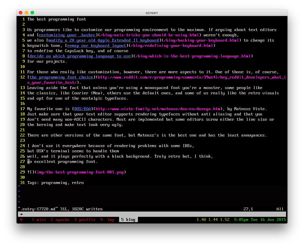
My favorite one is DOS/EGA, by Mateusz Viste. Just make sure that your text editor supports rendering typefaces without anti aliasing and that you don't need many non-ASCII characters. Most are implemented but some editors screw either the line size or the kerning and make text look very ugly.
There are other versions of the same font, but Mateusz's is the best one and has the least annoyances.
I don't use it everywhere because of rendering problems with some IDEs, but OSX's terminal seems to handle them well, and it plays perfectly with a black background. Truly retro but, I think, an excellent programming font.
Tags: programming, retro